Client
Café Olé!
Deliverables
Brand Strategy
Visual Identity
Motion Identity & System
Creative Team
Hamza Ouaziz
More than just a coffee shop, Café Olé offers a feeling - one of cute, calm, and wholesomeness, a destination for coffee lovers looking for a unique tasting and uplifting experience.
This project outlines our approach to building a brand identity that reflects and effectively communicates this concept, balancing “cute” and “wholesome” and incorporating animation across all touchpoints, enhancing the user experience, building brand immersion, and ultimately maximizing Café Olé’s appeal.
Meet Olé Bear:
Meet our wholesome Mascot. We chose a combination mark with a focus on the mascot, a young brown bear, often associated with cuddliness, comfort and wholesomeness.
This friendly simplification of a bear serves as a visual anchor for the brand and instantly communicates its wholesome nature and aligns perfectly with the delightful experience that the brand wants to create.
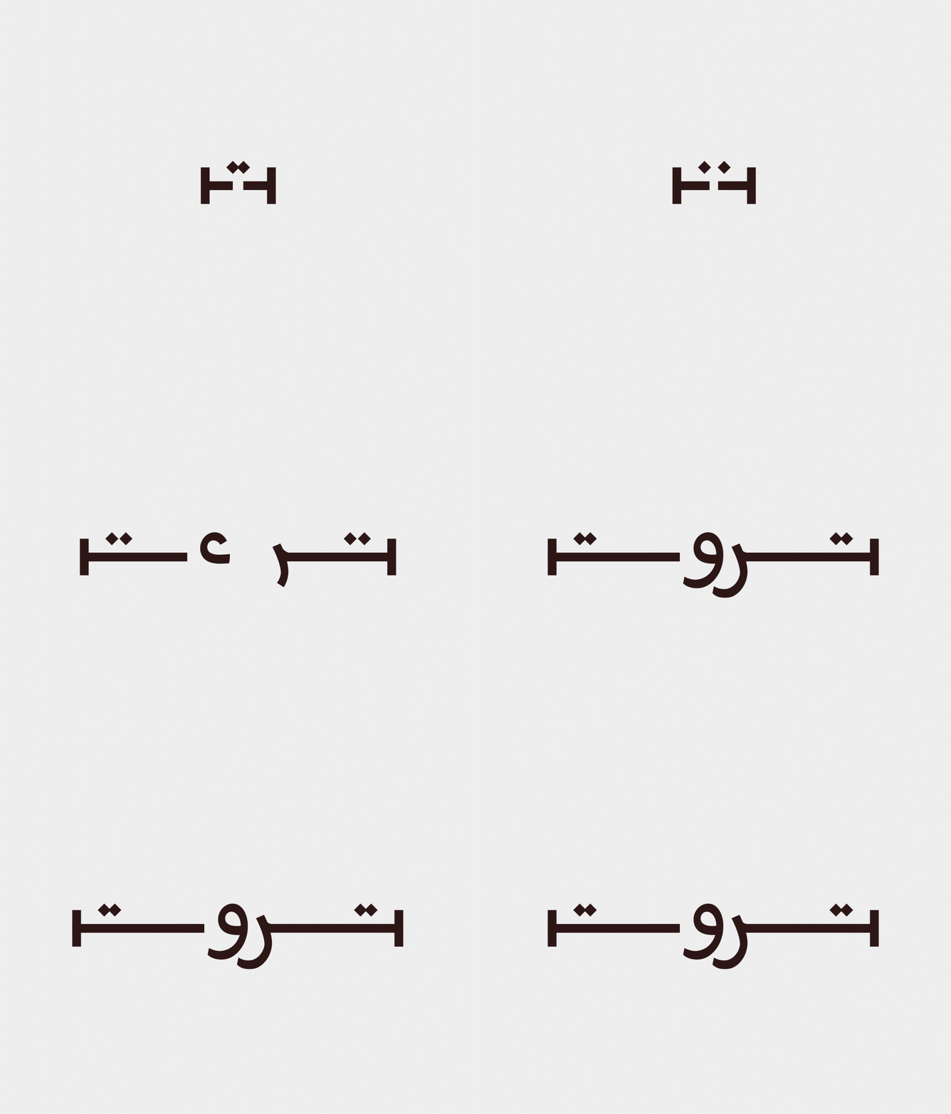
Custom Font:
To translate the energy and positivity of the brand, the font is designed with movement Simple lines and curves are the main ingredients, inspired by the
trees that Olé bear uses to scratch his back, the simplicity and colors gives it an organic feel.
We deliberately designed the Café Olé font to not be bound by fixed positioning or alignment.
We deliberately designed the Café Olé font to not be bound by fixed positioning or alignment.
This choice was made to grant it visual freedom and add to the brand’s playful and approachable energy.
Motion Principles:
To ensure the animations within Café Olé truly capture its fun, wholesome personality, we developed two core motion principles that would apply and guide the creation of all animated elements across digital screens and touchpoints.
Sunshine Start:
Sunshine Start embodies the optimism and cheerful spirit of Café Olé. Each motion should begin with a positive energy, mirroring the uplifting feeling of a bright morning and a fresh cup of coffee. Conceptually, it sets a happy tone for the animation and evokes feelings of joy, positivity and gentle encouragement.
Sunshine Start embodies the optimism and cheerful spirit of Café Olé. Each motion should begin with a positive energy, mirroring the uplifting feeling of a bright morning and a fresh cup of coffee. Conceptually, it sets a happy tone for the animation and evokes feelings of joy, positivity and gentle encouragement.
Gentle Playfulness:
Gentle Playful embodies the energetic and constantly engaging style of Café Olé, characterized by secondary motions, delightful jiggles and bounces. This principle injects a dose of fun and approachability into every animation.
Gentle Playful embodies the energetic and constantly engaging style of Café Olé, characterized by secondary motions, delightful jiggles and bounces. This principle injects a dose of fun and approachability into every animation.
Ordering Experience:
Expanding the digital expression of Café Olé, we designed fully animated menus for in-café display, with a captivating intro and highlighting menu items in a full loop.
This continuous animation keeps the menu engaging while subtly enticing customers.
This continuous animation keeps the menu engaging while subtly enticing customers.
Queue Experience:
Inspired by Mcdonald’s order queue display, we designed a screen that features order numbers and dynamically updates their status as “brewing” or “completed” and playfully brings them to life with order reveal and transition animations, along with interactive Olé Bear animations.


