
Client
Maradd
Deliverables
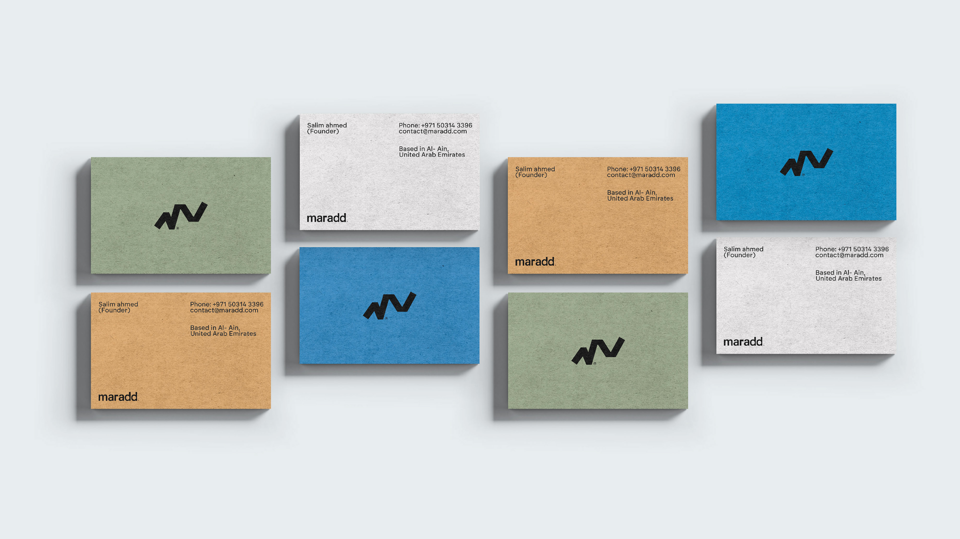
Brand Identity
Motion Identity & System
Social media animations
Creative Team
Hamza Ouaziz
Featured Awards
Behance - Featured in Branding
World Brand Design Society - Bronze for Identity
INDIGO - Gold Winner in Branding for Travel
INDIGO - Silver Winner in Branding for Retailer
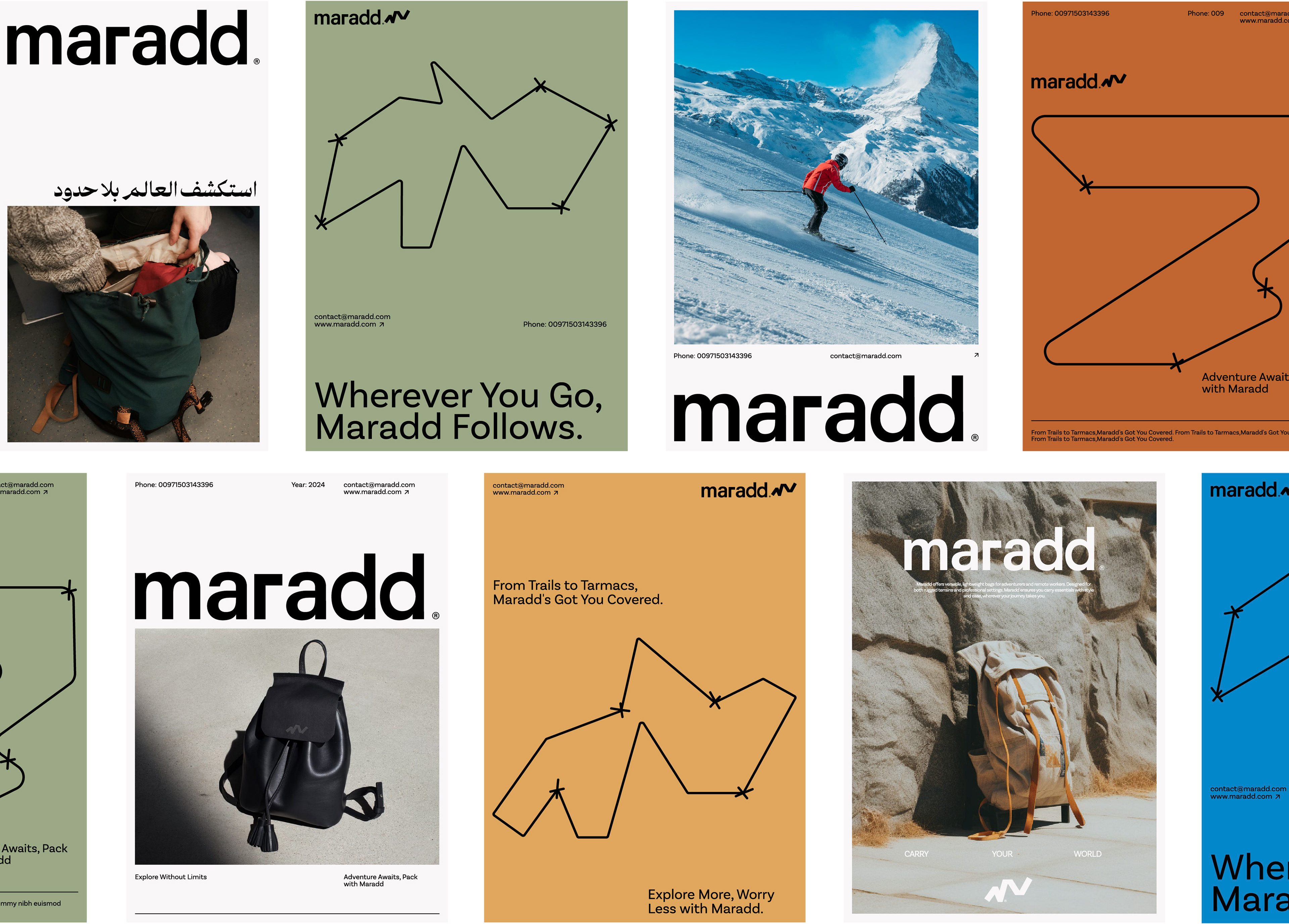
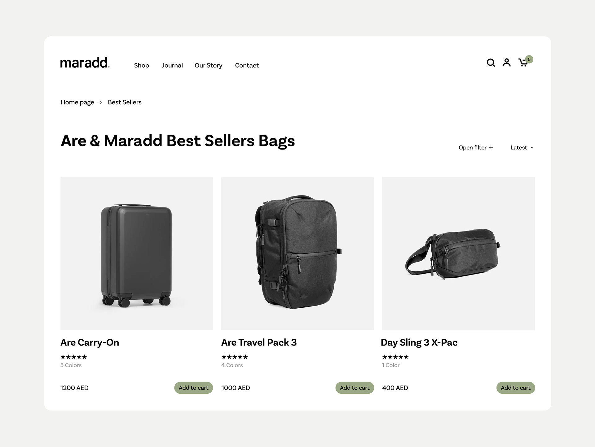
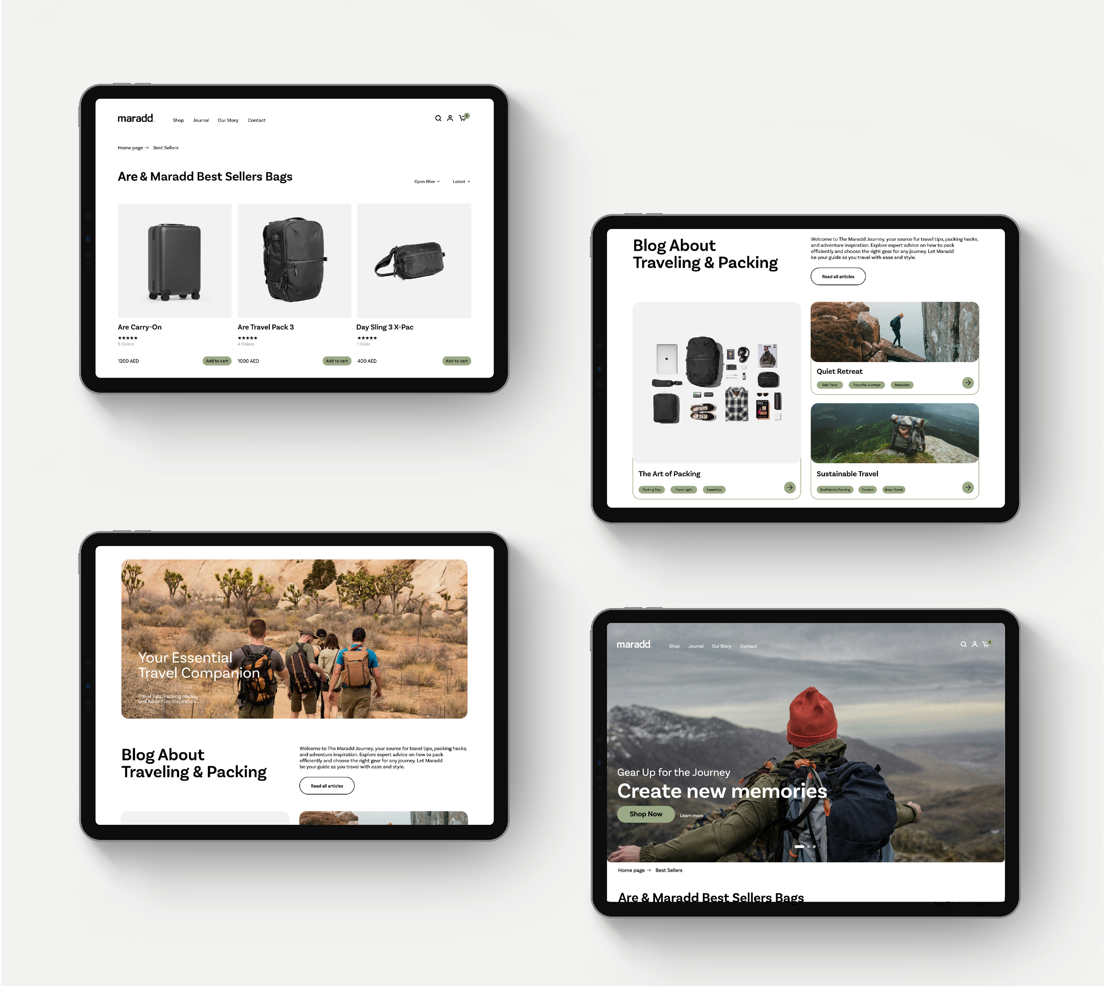
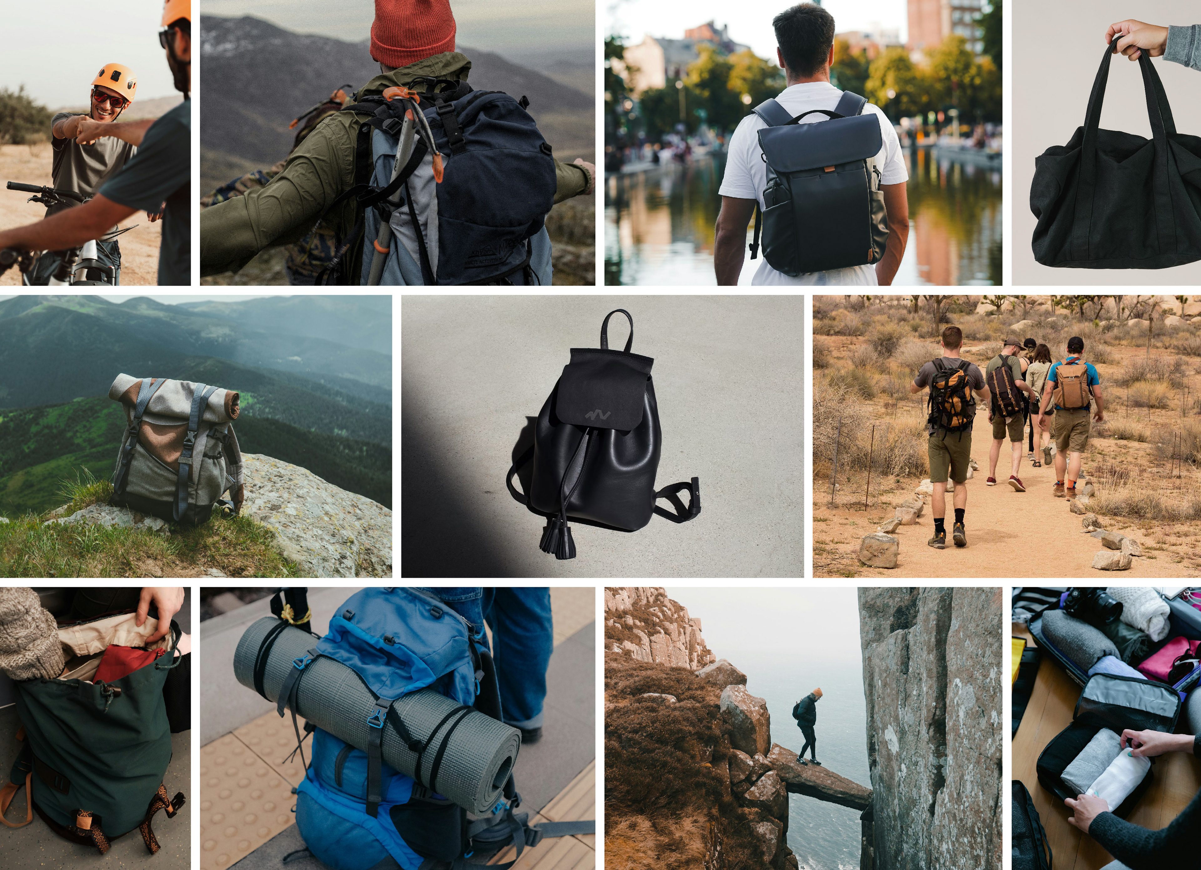
Maradd is a brand that resells high-quality backpacks designed for frequent travelers, adventure seekers who challenge themselves every day, and remote workers in need of functional, stylish gear.
The name "Maradd" means "Going back home" or "Returning to places you love," reflecting the brand's connection to journeys that bring you back to familiar, cherished destinations.
The Challenge:
The challenge was to bridge the brand's name with its mission. We needed to create a brand identity that captured the essence of "returning home" or "places you love," evoking a sense of belonging while appealing to those drawn to exploration. This concept had to resonate with both adventure enthusiasts and remote workers, building an emotional connection with Maradd’s audience.
The Solution:
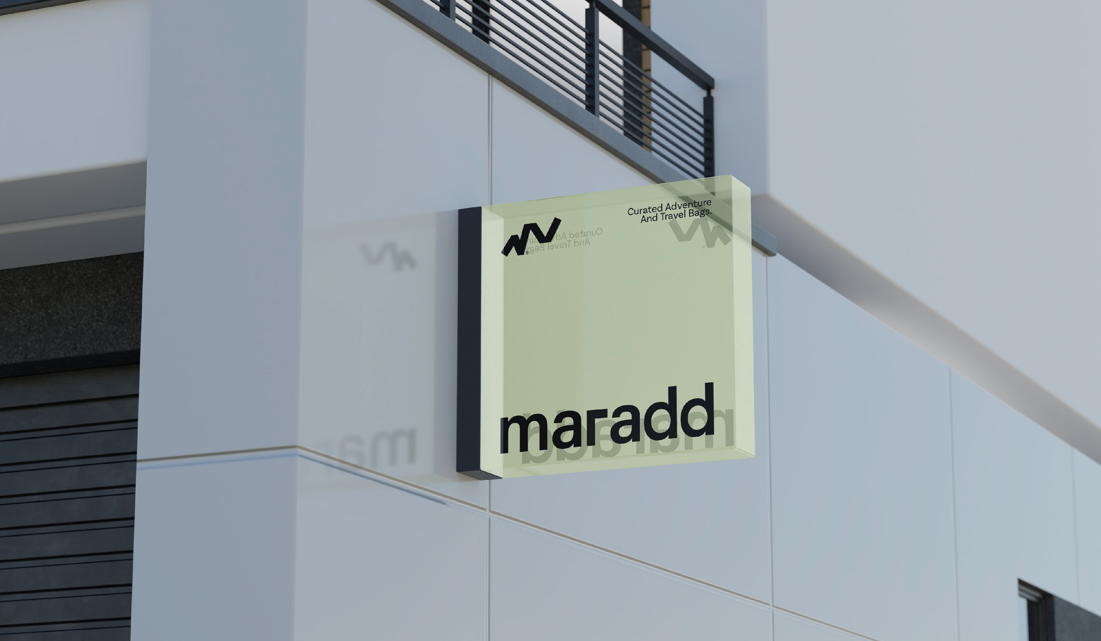
We created a brand identity that reflects Maradd's journey-focused ethos, using earthy, nature-inspired colors to evoke destinations that resonate with travelers. The logo and graphic elements incorporate pathways and trails, symbolizing exploration and the idea of returning to meaningful places. This cohesive branding allows Maradd to connect with its audience on a deeper level, offering them not just backpacks, but companions for their journeys back to places they hold dear.

The Maradd Logo in Motion:
Building Maradd's concept and identity, I animated the logo to mimic a traveler exploring a landscape, speeding up, slowing down, and pausing naturally, reflecting a sense of real movement and curiosity.
At the end of this journey, the logo mark zooms in, and the typography follows from the left, arriving with a graceful ease, designed to work seamlessly in both Arabic and Latin versions.
At the end of this journey, the logo mark zooms in, and the typography follows from the left, arriving with a graceful ease, designed to work seamlessly in both Arabic and Latin versions.
Bringing Maradd to life Through Motion:
The brand concept depicted a traveler's journey as closed paths with round and smooth curves, each path is different, but they're all closed paths that have marks which are checkpoints where the traveler pauses, to take shelter or admire the view before continuing, eventually returning to the starting point.
I translated this concept into motion, creating animations that visually narrate the traveler's journey across different paths and maps, capturing the essence of exploration through the zoom in and acknowledging the pauses and building suspense before zooming out to show the whole path.
This animation gives the brand flexibility to use it as a suspenseful teaser, building anticipation and retaining an element of surprise for reveals at the very end.