

Client
Haulerz
Deliverables
Visual Identity
Motion Identity & System
Motion Identity & System
Creative Team
Hamza Ouaziz
Essence Agency
Essence Agency
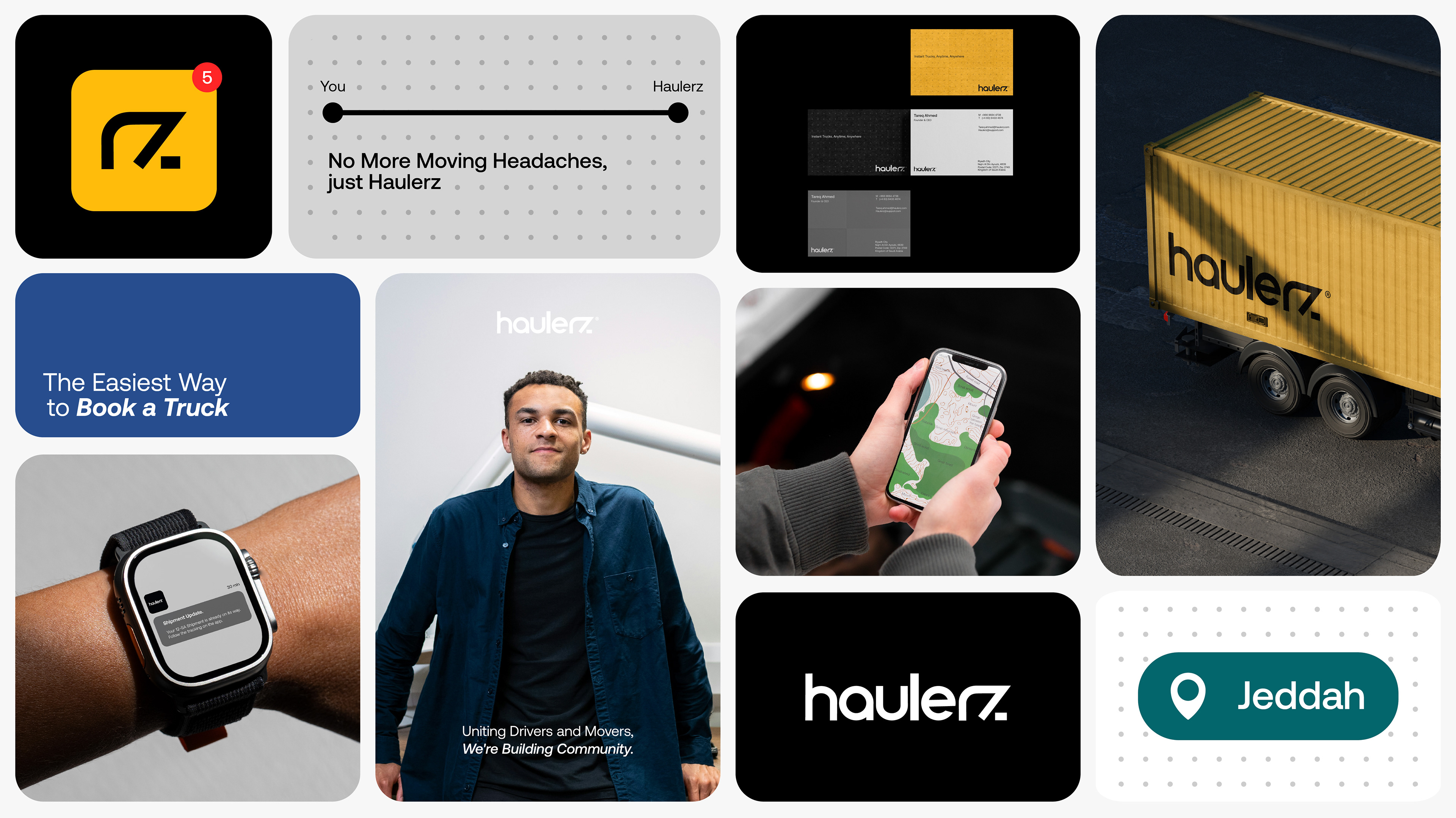
Haulerz - Transportation & Logistics - Instant Trucks, Anytime, Anywhere
Haulerz is an intermediary app that connects truck owners with customers who need to ship their belongings quickly and efficiently. Designed for both individual and business needs, Haulerz makes renting a truck as simple as tapping a button. The brand name “Haulerz” comes from the word “haul,” representing movement, delivery, and progress, perfectly aligning with the brand’s mission to make truck access instant and hassle-free.
The Challenge:
The challenge was to create a brand identity that communicates speed, simplicity, and trust while appealing to two very different audiences, truck drivers and customers. We needed a visual language that is bold and approachable, ensuring the brand feels accessible without losing a sense of professionalism and reliability.
The Solution:
We developed a modern and minimal identity that communicates speed, reliability, and accessibility. The system connects two distinct audiences, truck drivers and customers, through a unified brand experience that is bold yet approachable, ensuring instant recognition and trust.
Creative Direction:
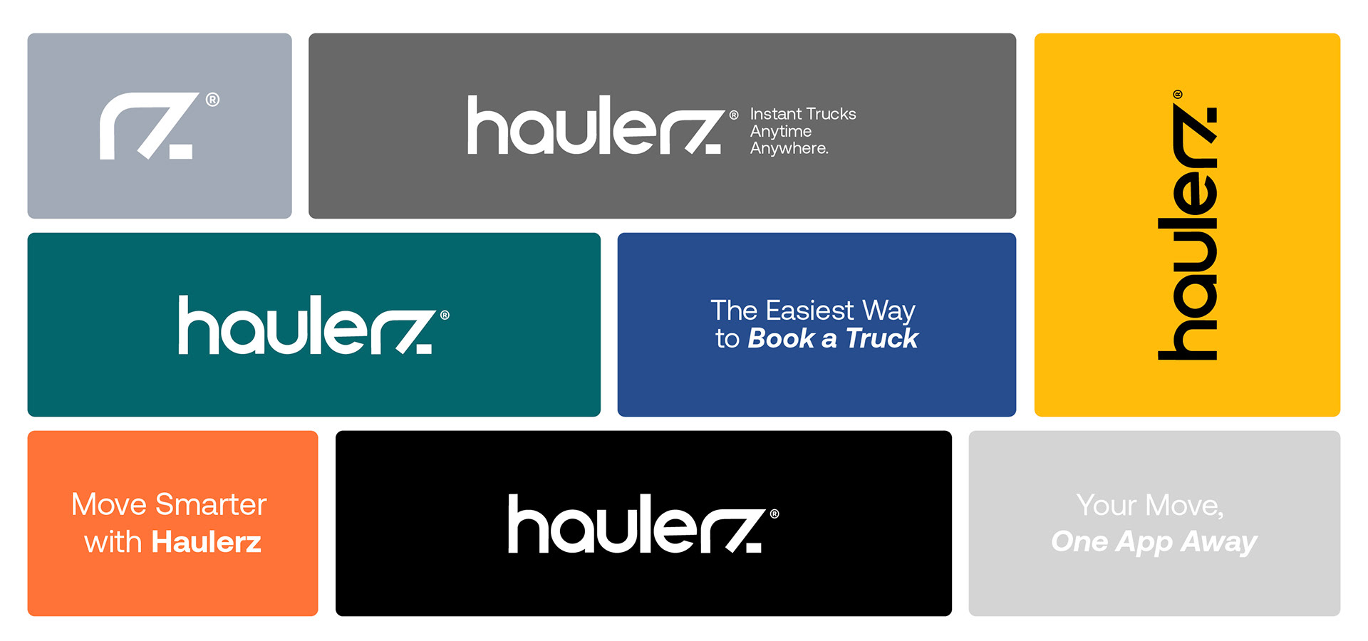
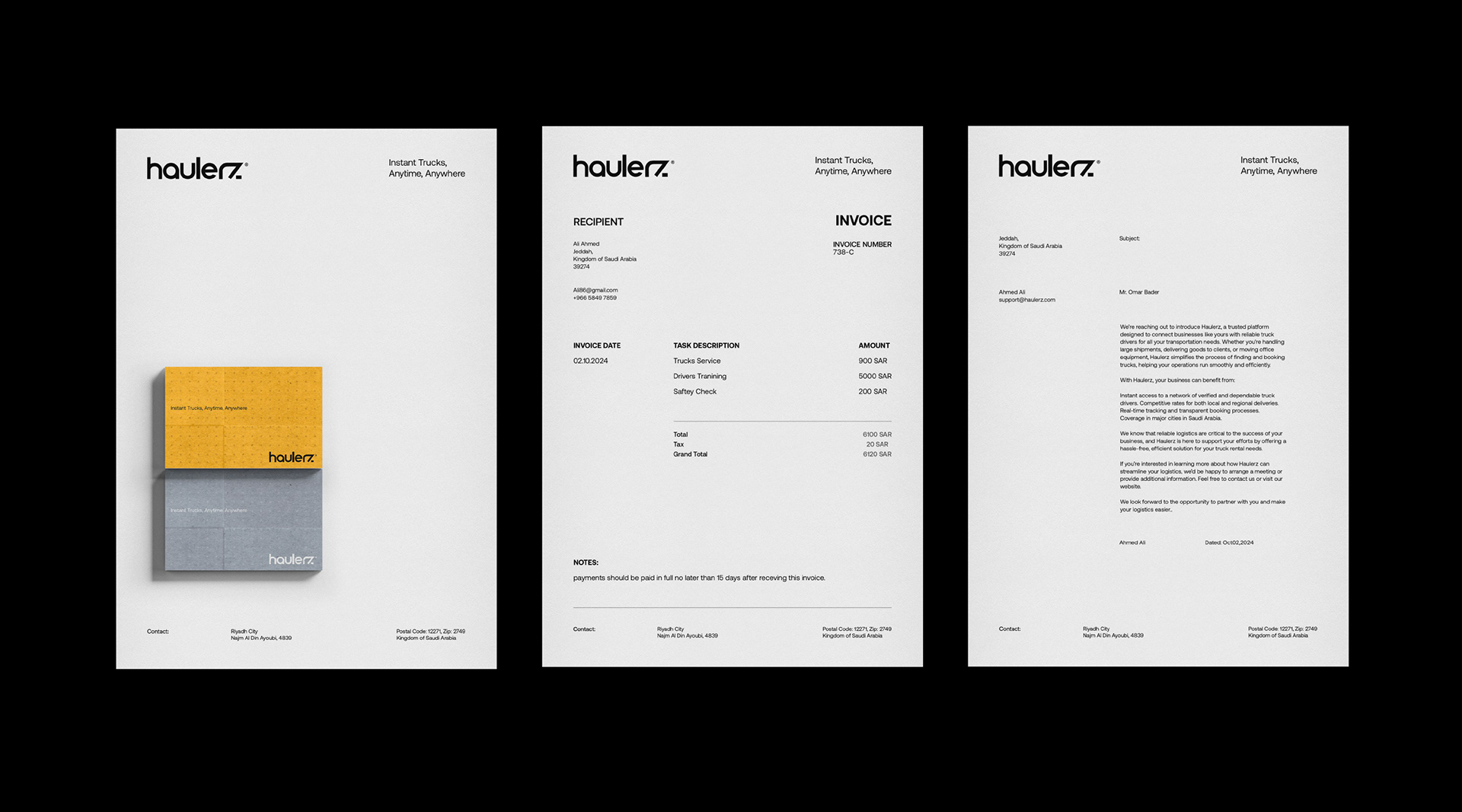
Our creative approach for the "Haulerz" identity focused on creating a visual system that reflects movement, connectivity, and accessibility. The goal was to design a brand that feels fast, trustworthy, and approachable for both truck drivers and customers.
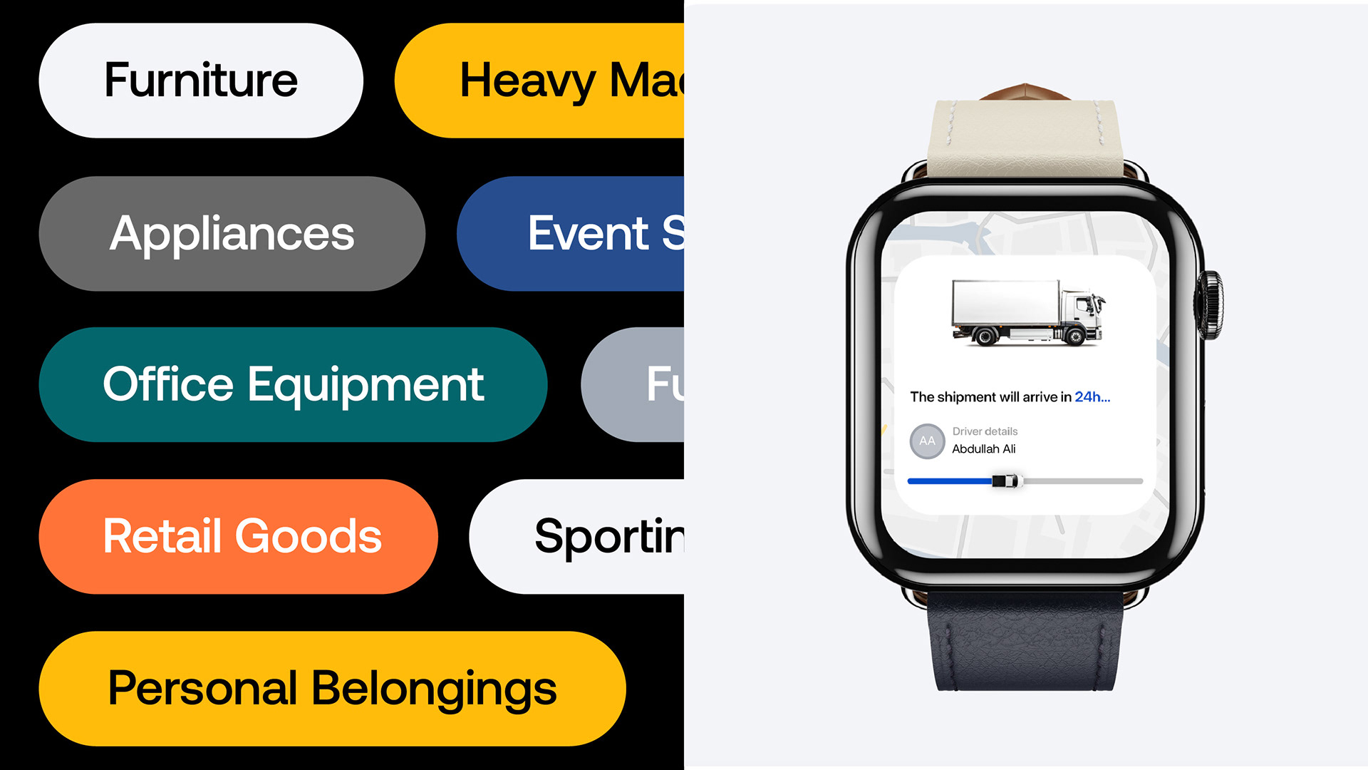
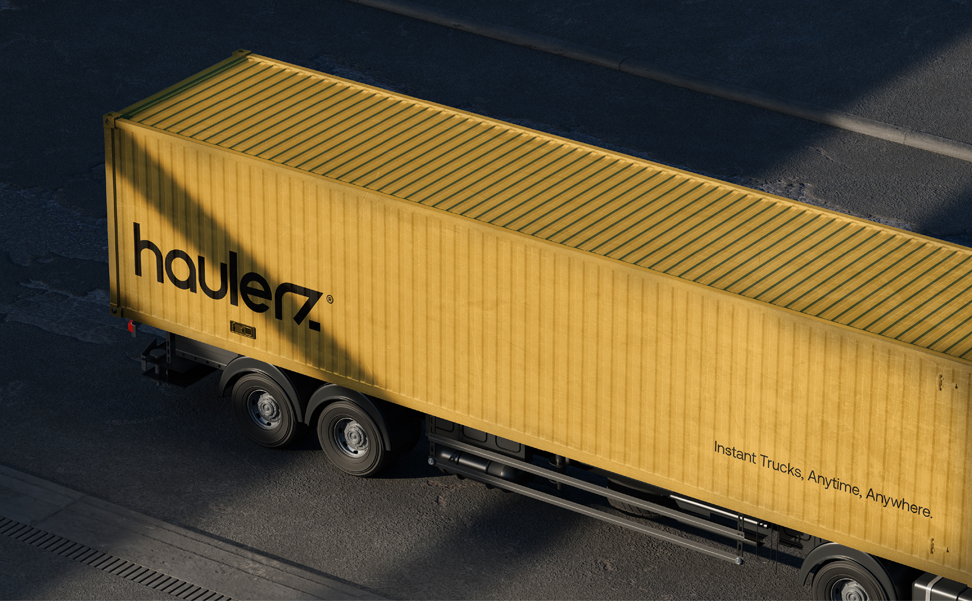
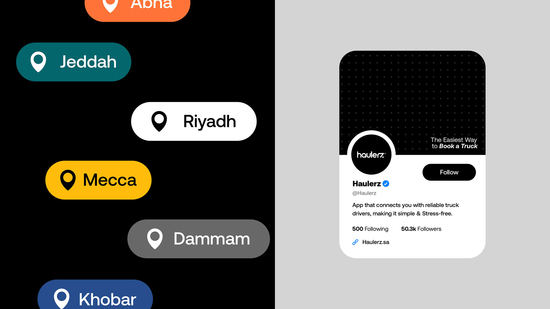
The wordmark’s distinctive “Z” integrates an arrow, symbolizing progress and forward motion. A dot grid pattern represents map locations and connection points, with connecting lines inspired by roads and routes. This visual system reinforces the brand’s mission to simplify truck rentals while keeping movement at the heart of its identity.
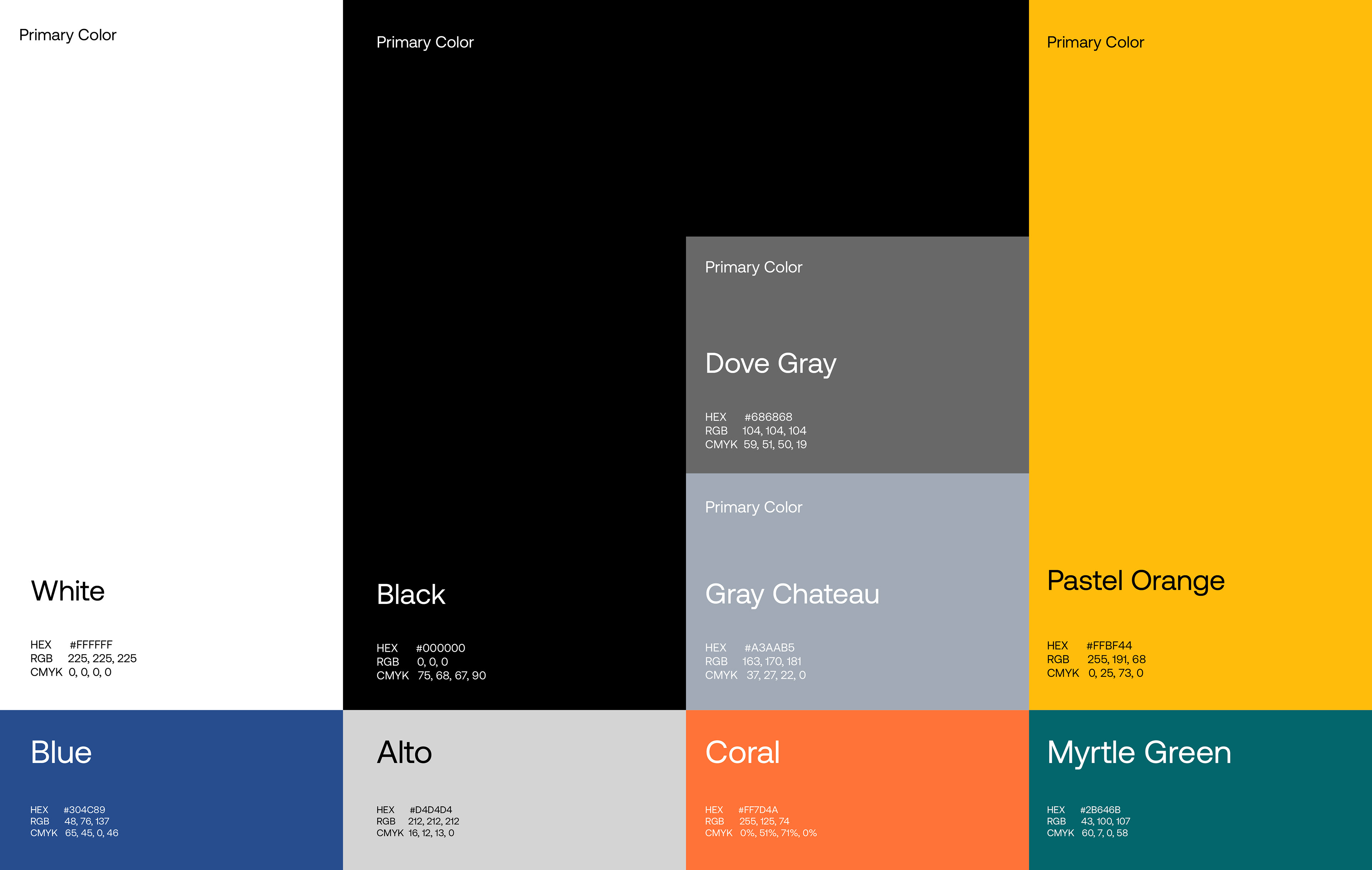
The bold yellow and black palette maximizes visibility, while the minimal design approach ensures flexibility across digital platforms, print materials, and vehicle branding - creating a consistent sense of motion and reliability across all touchpoints.
The Core Motion Principle: "The Journey"
The foundation of the Haulerz’s motion system is “The Journey”, a visual metaphor for the brand’s core services.
This concept is brought to life through animated lines connecting the dots of the brand’s grid pattern. Each Line begins its journey with a gentle ease-in, accelerates quickly and smoothly eases out upon reaching its destination.
The Logo in Motion: Drawing the Connection
To reinforce the brand’s identity and its mission of connectivity, we developed a dynamic logo animation. The wordmark “Haulerz” is drawn on-screen by animated strokes, directly referencing the motion principle.
The Animated Environment: The Haulerz Grid
To develop an integrated and immersive digital experience, we designed a series of subtle, animated backgrounds from the brand’s dot grid system.
Logo Animation Variations:
We created three versions of these animations to have complete flexibility: A reveal from the left, the right and the center. They may go on the loading screen of the app, website background, or social media posts to create constant subtle movement and technological sense. This way, even if no key message appears on screen, the Haulerz brand identity should always feel active and interesting.
Animated Icons:
We also created a set of 15 essential icons for mobile and web usage that all follow the same easing and style that we set, matching the Haulerz identity and visual identity, and adding more interactivity and liveliness to the brand.